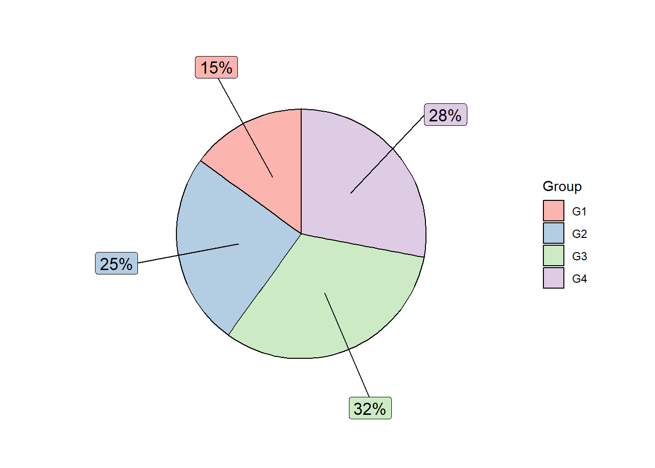
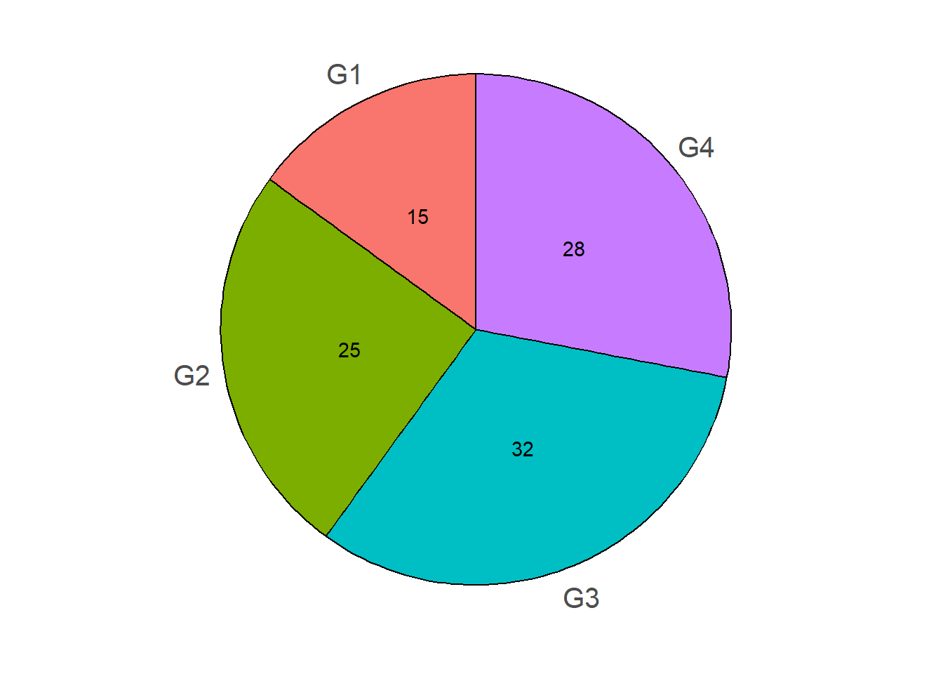
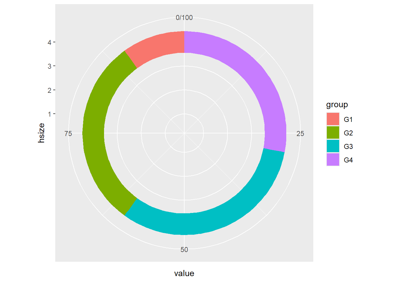
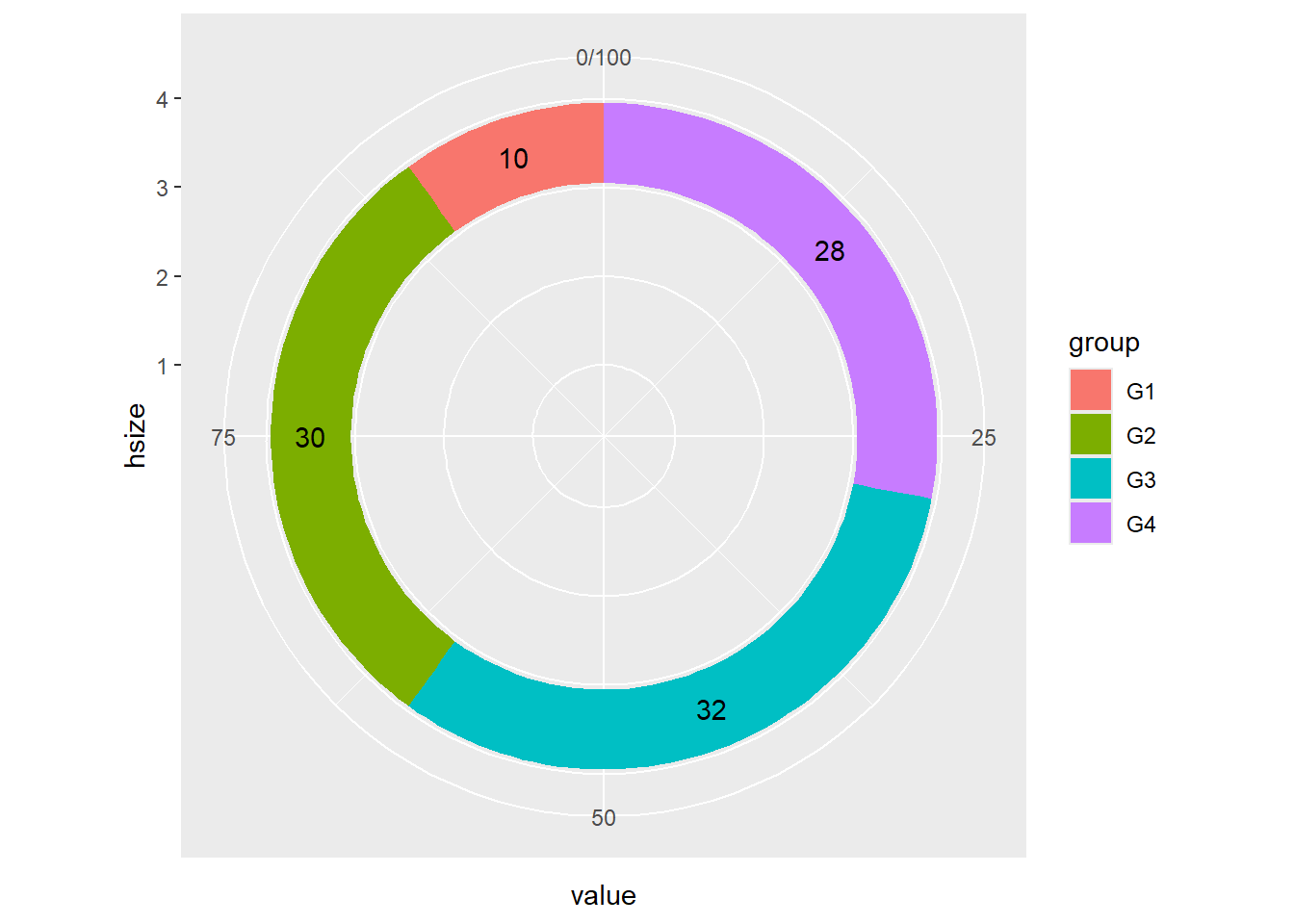
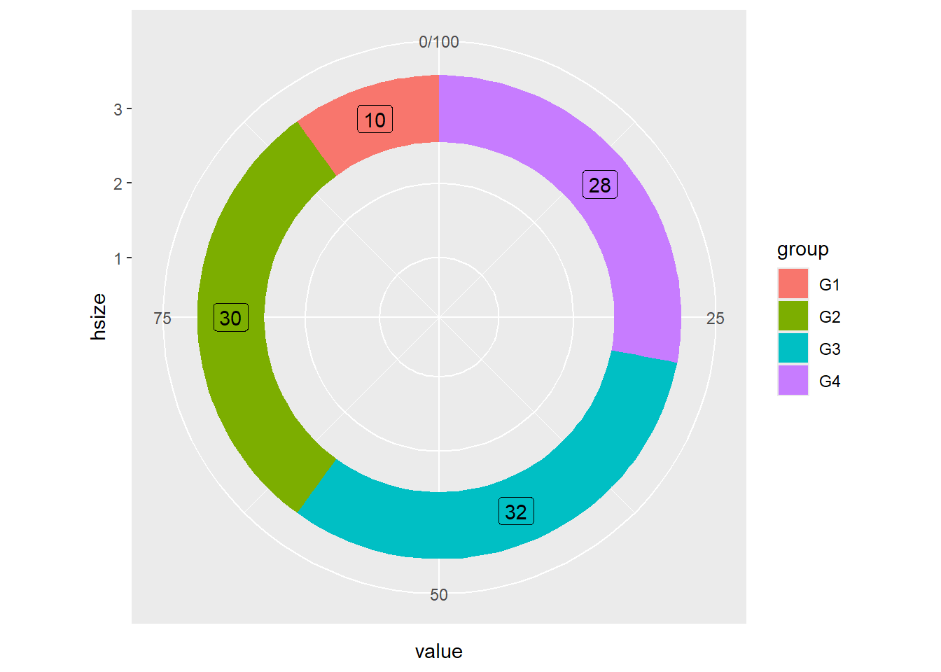
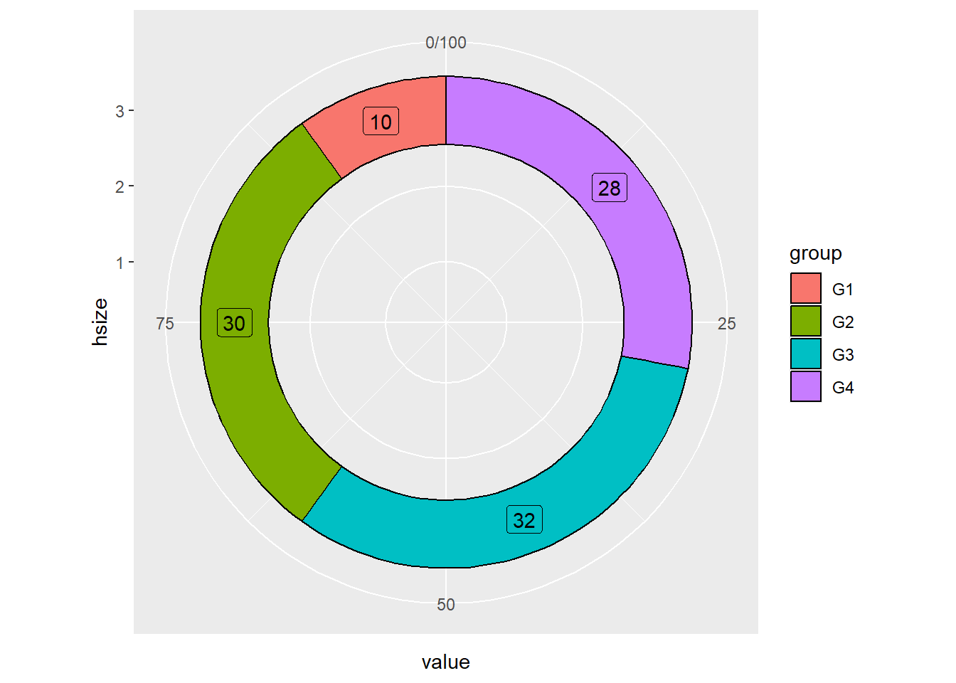
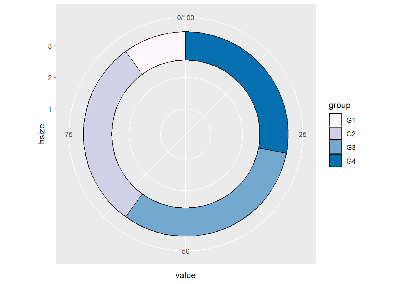
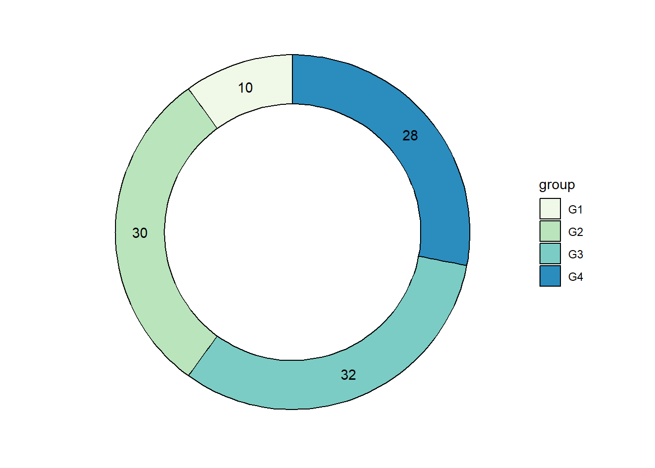
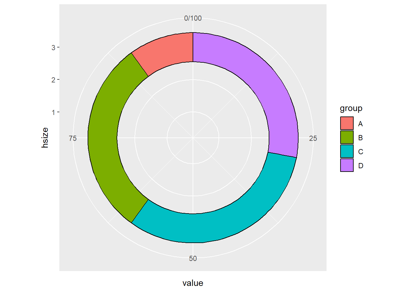
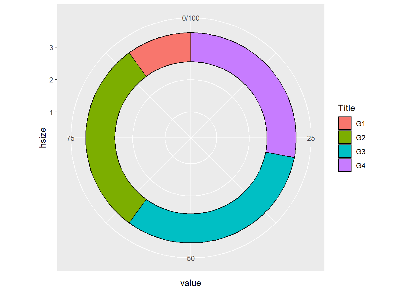
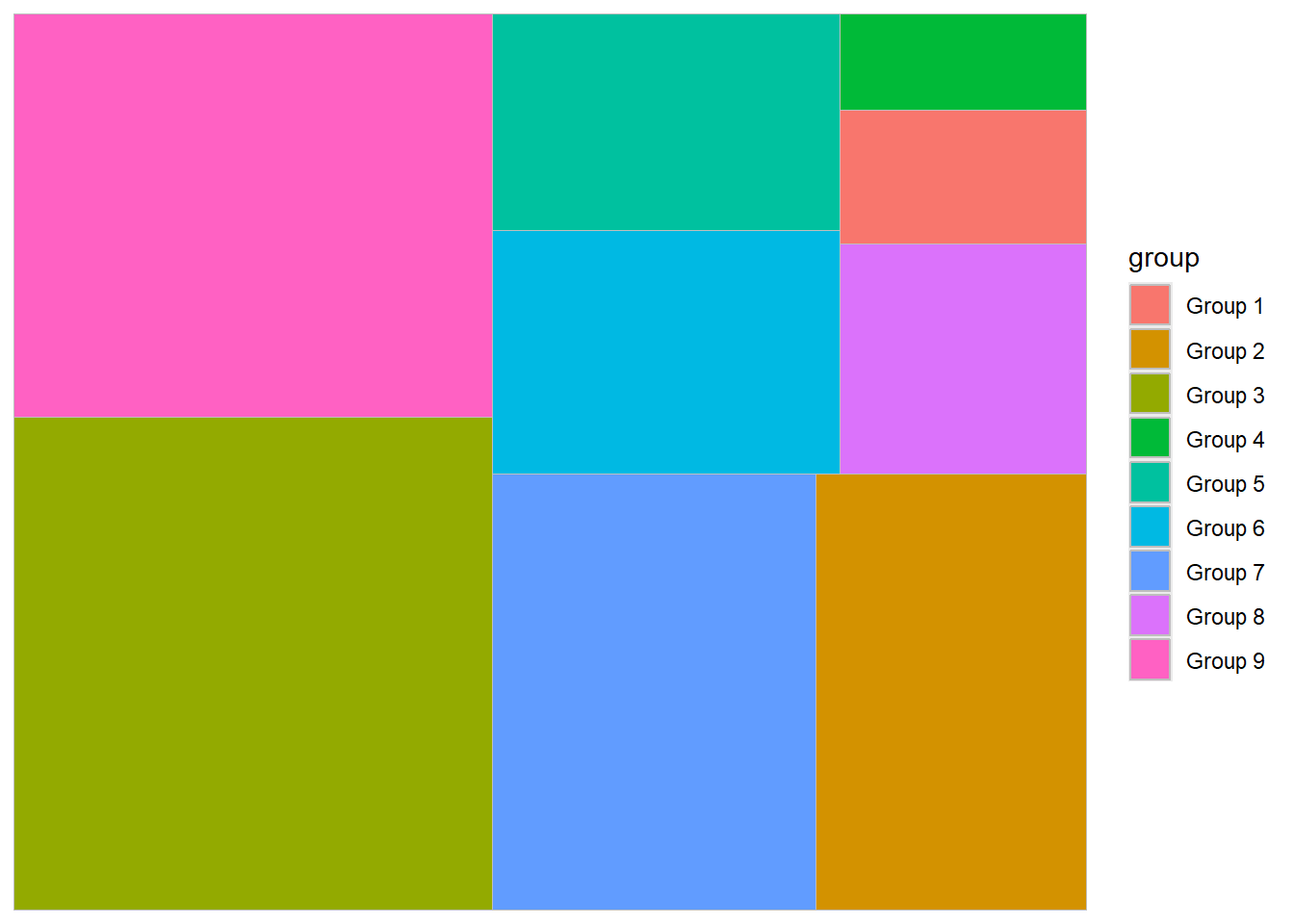
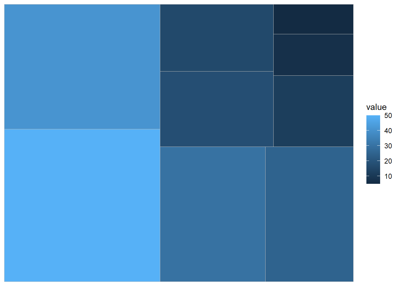
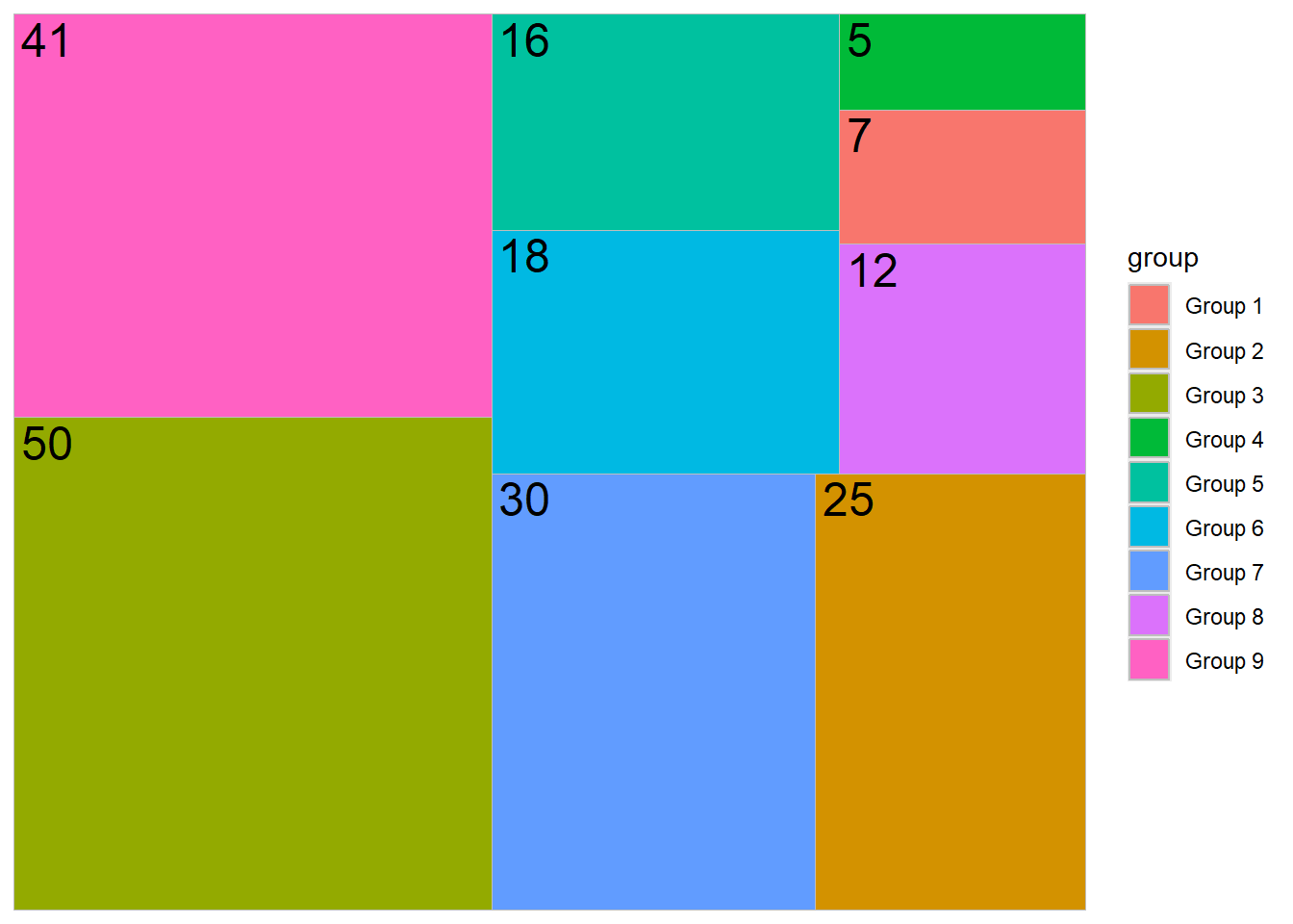
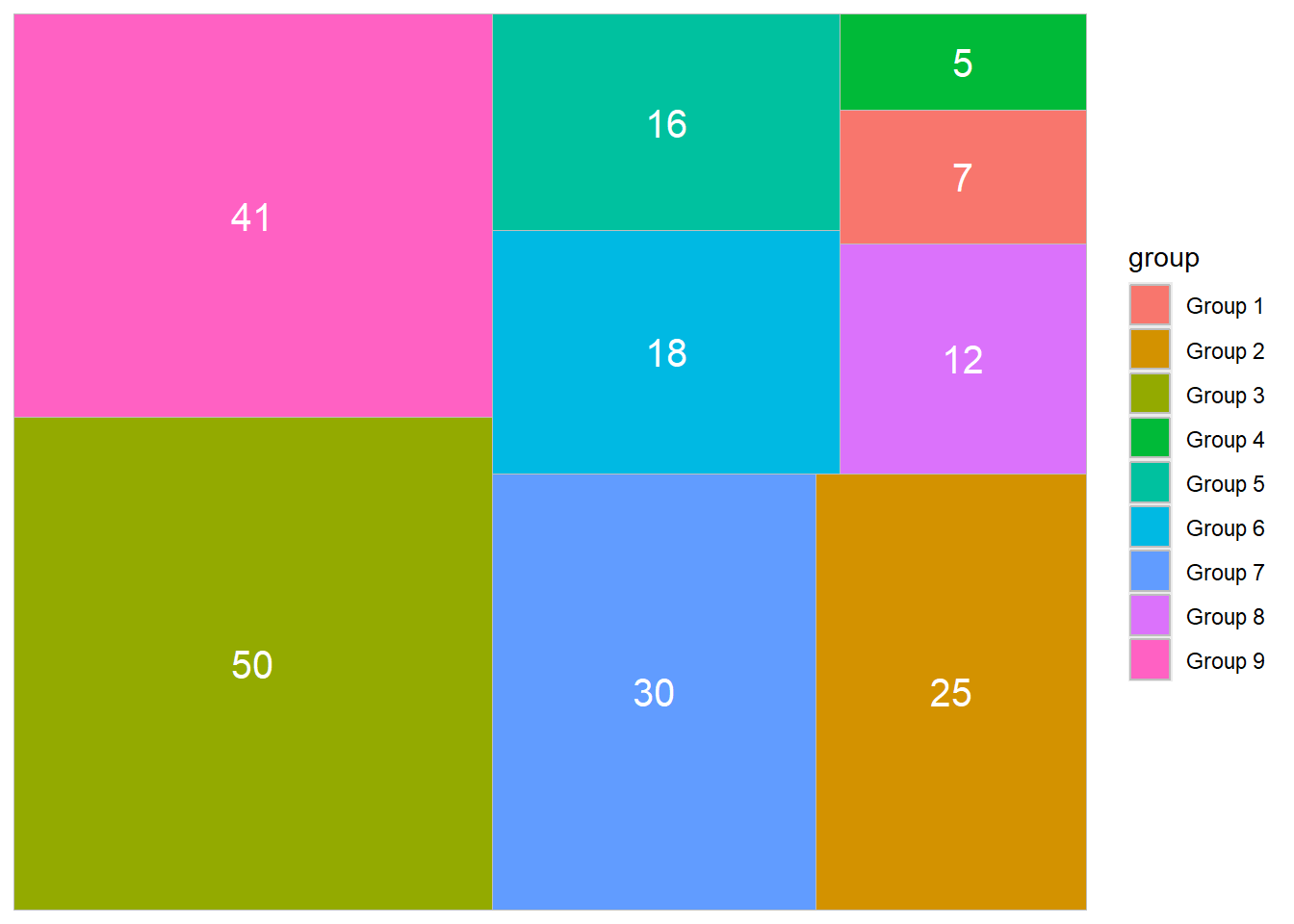
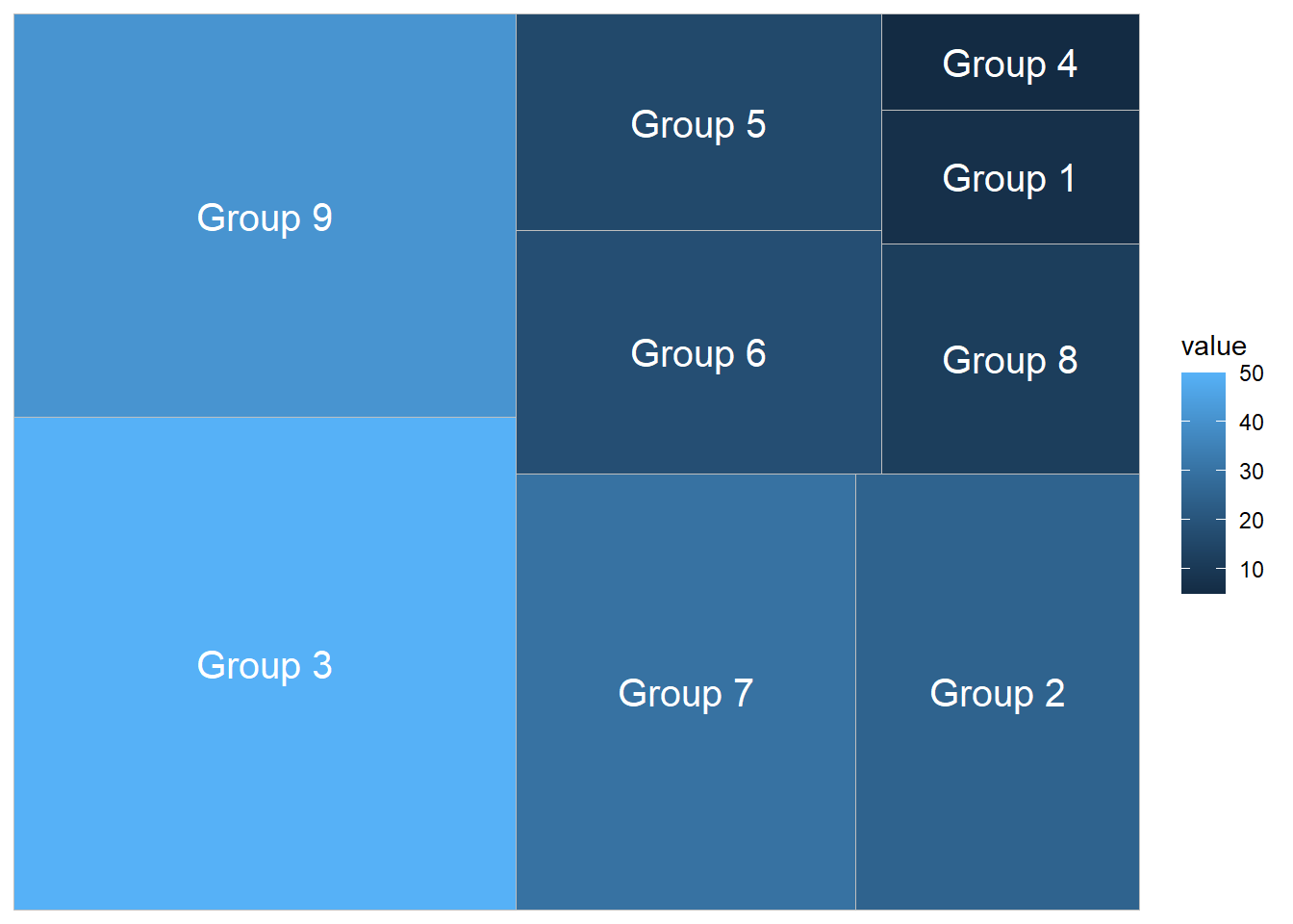
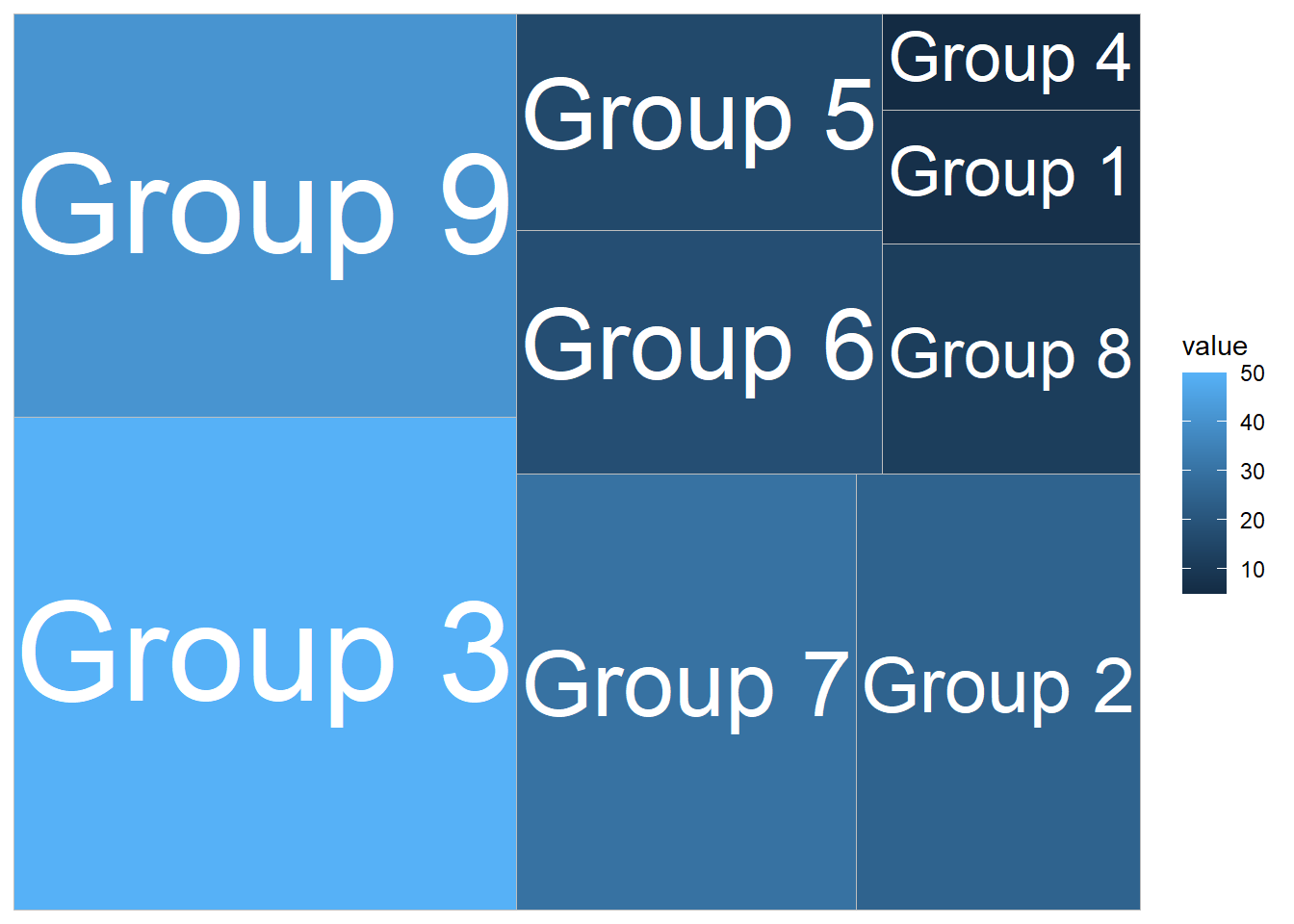
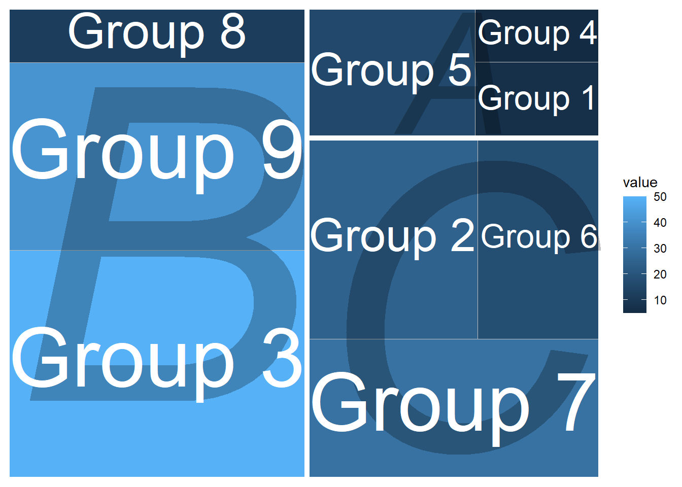
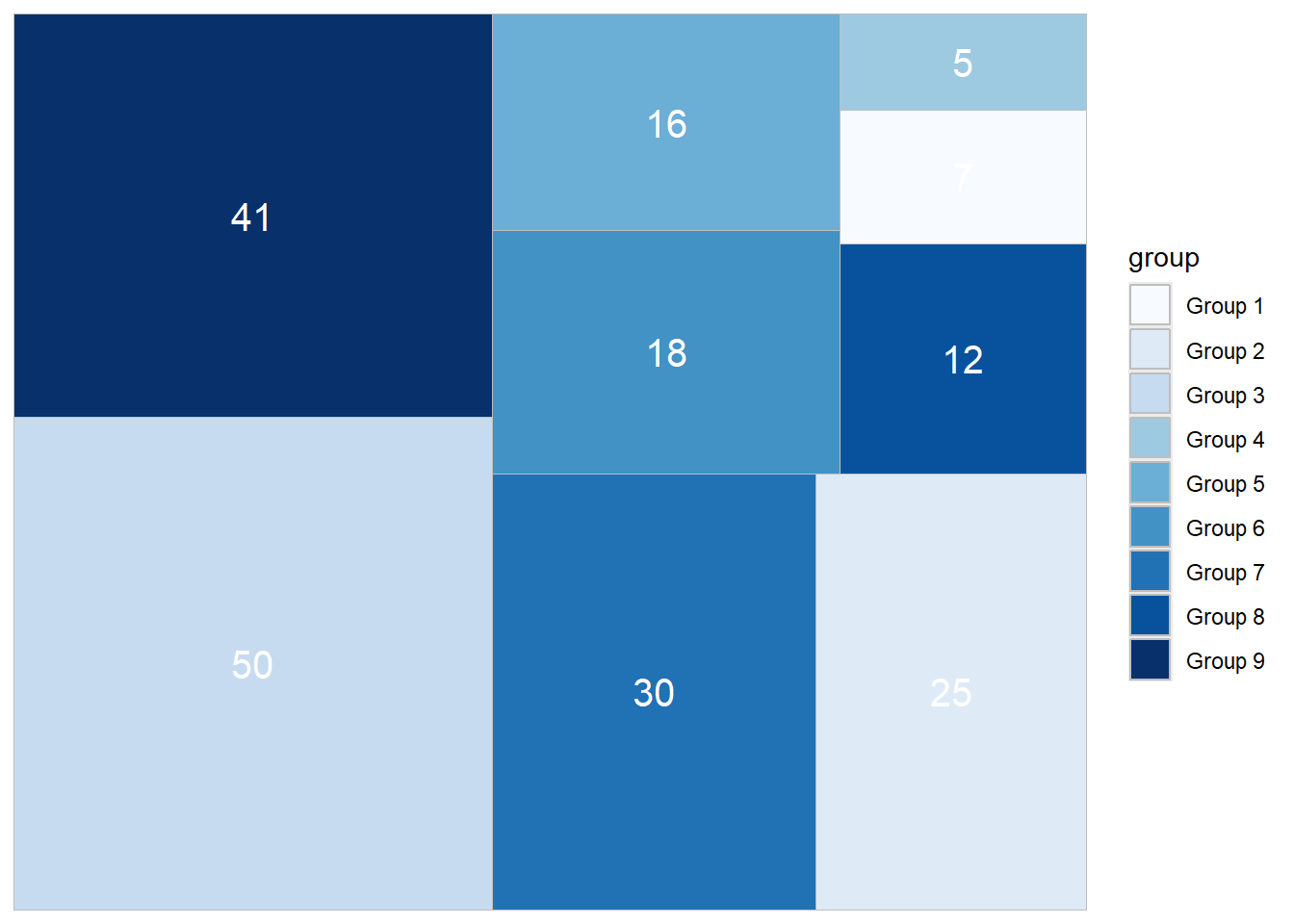
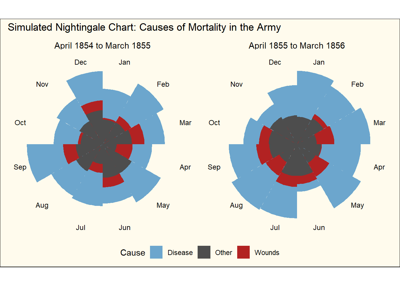
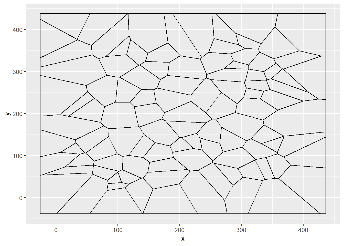
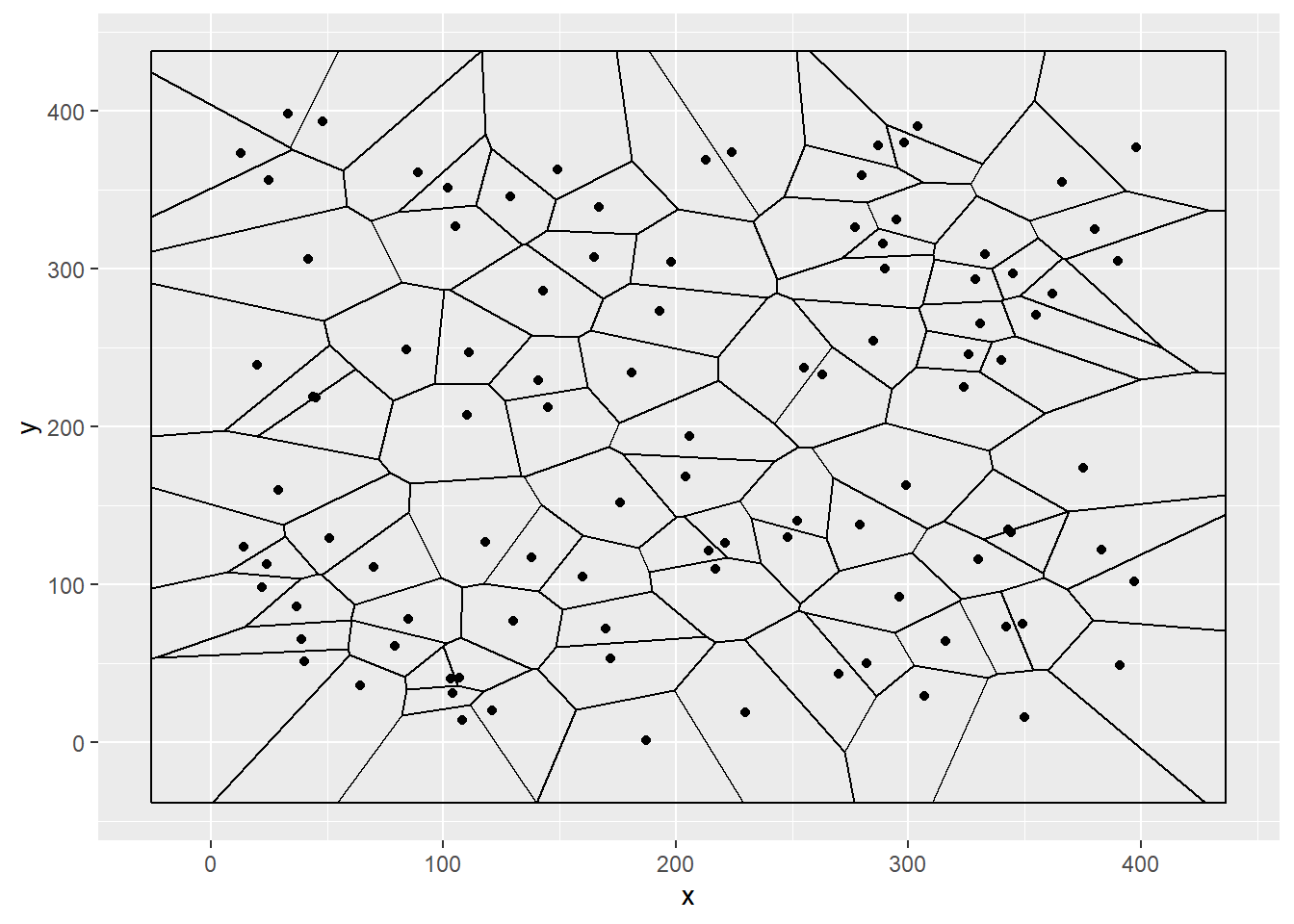
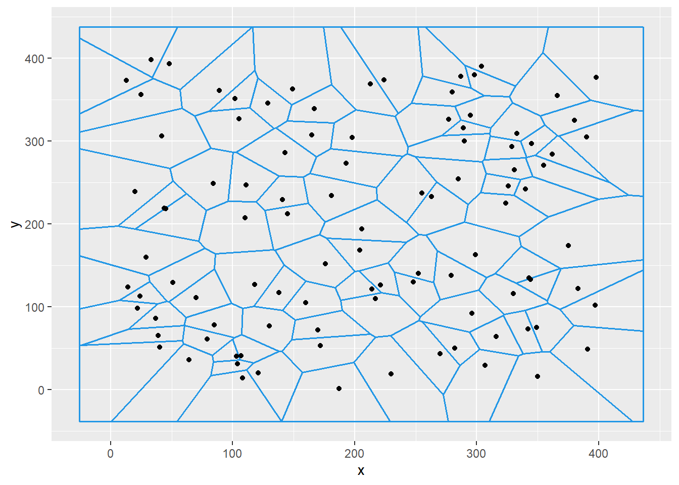
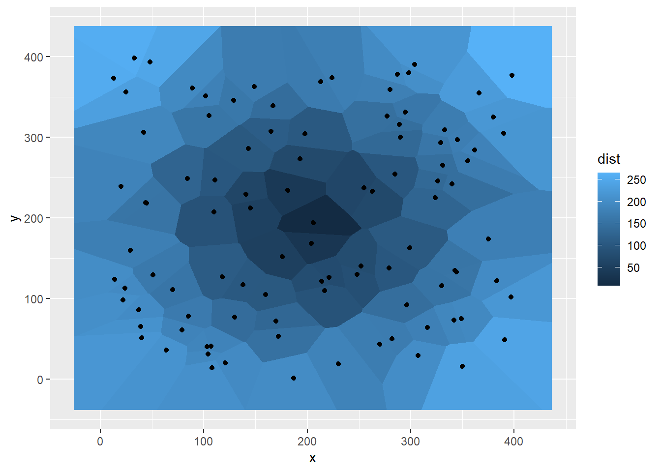
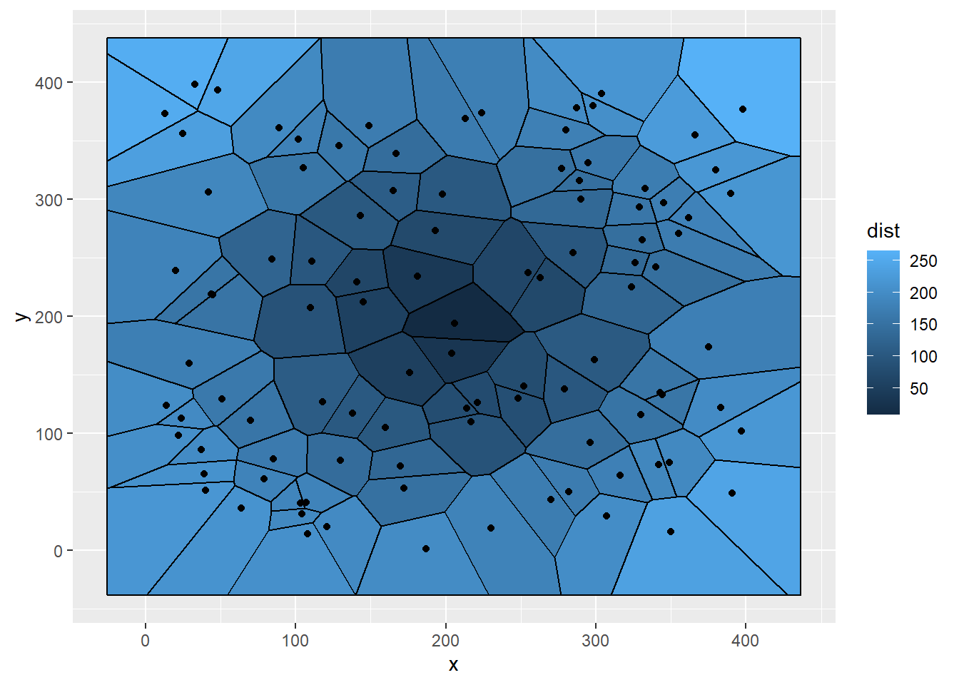
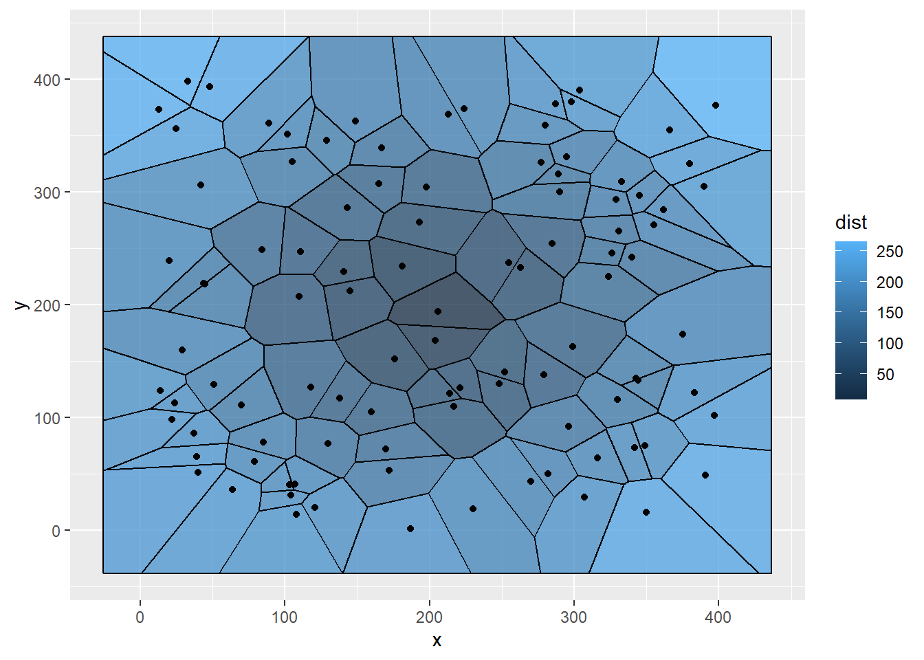
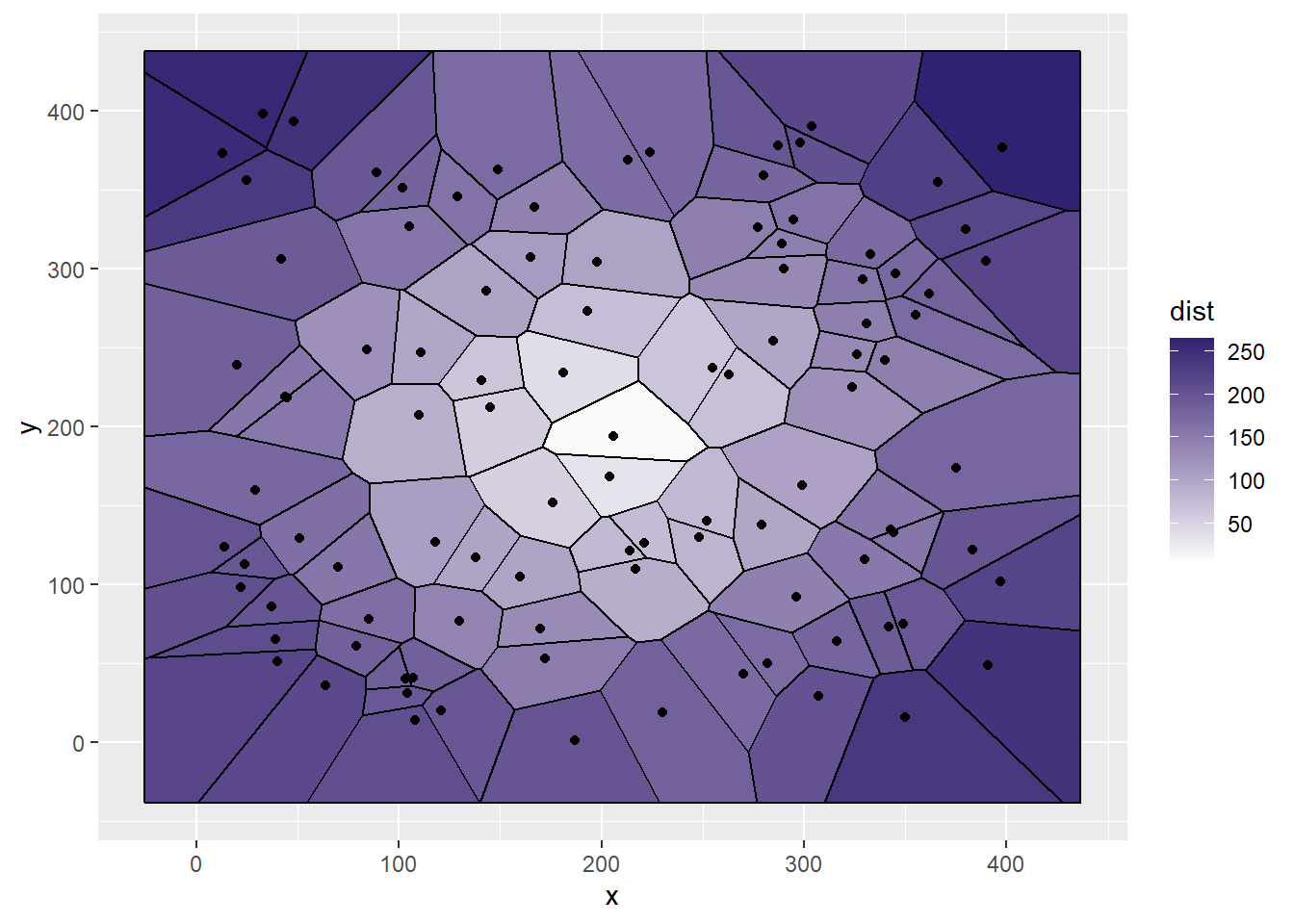
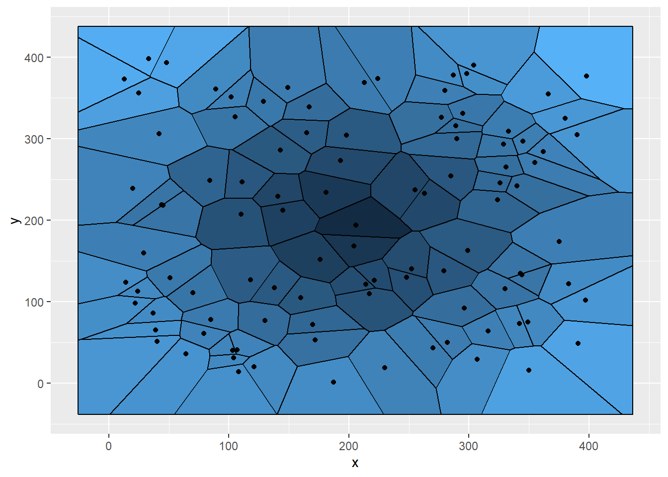
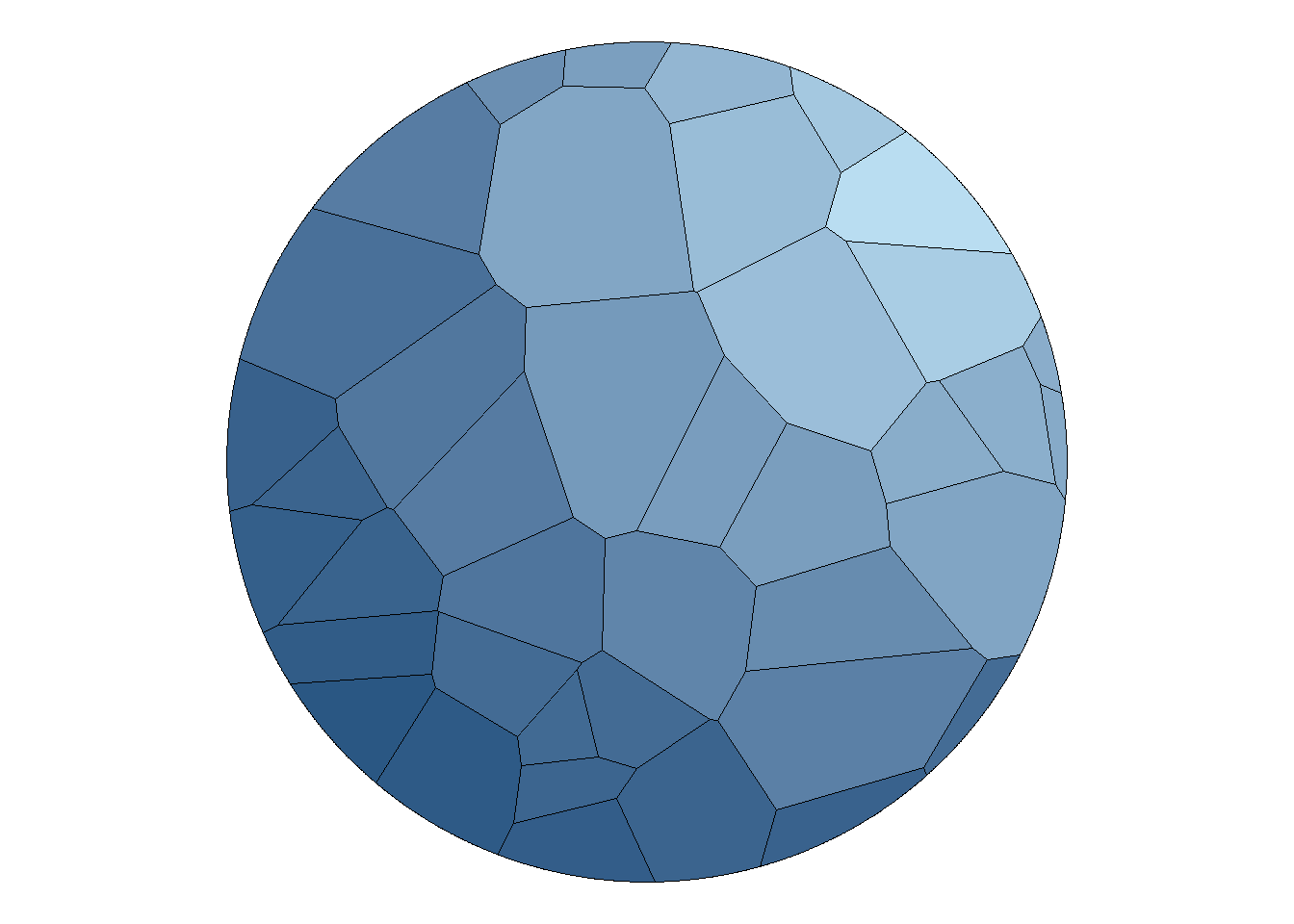
# Proporsi dan Komposisi {#proporsi-dan-komposisi} ```{r setup, include=FALSE} # Set Working Directory opts_knit$set(root.dir = normalizePath("./")) ``` ## Pie Charts {#pie-charts} 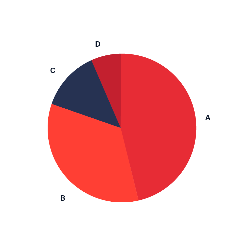 {width="179"} 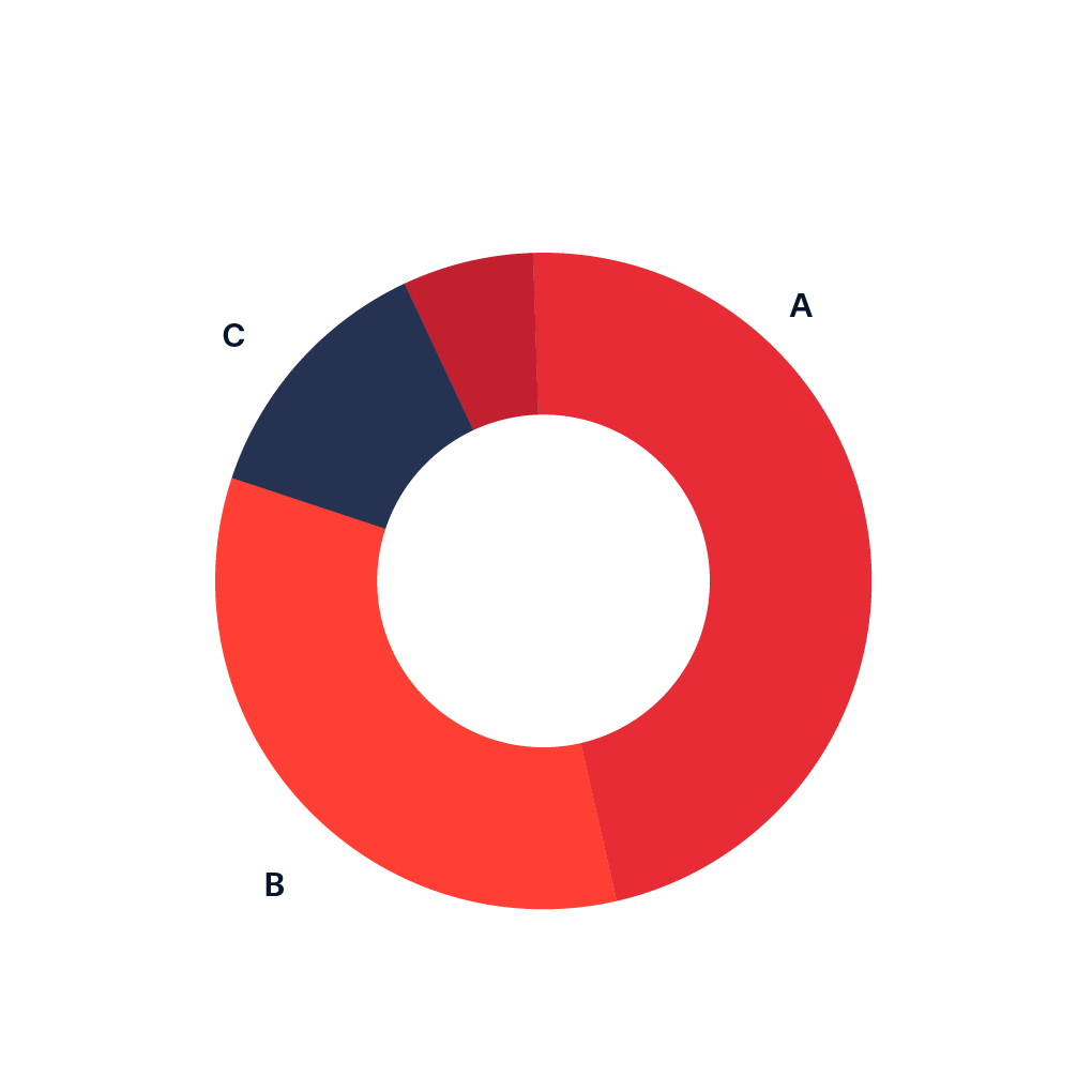 {width="180"}### Pie ```{r} <- data.frame (value = c (15 , 25 , 32 , 28 ),group = paste0 ("G" , 1 : 4 ))# Get the positions <- df %>% mutate (csum = rev (cumsum (rev (value))), pos = value/ 2 + lead (csum, 1 ),pos = if_else (is.na (pos), value/ 2 , pos))ggplot (df, aes (x = "" , y = value, fill = fct_inorder (group))) + geom_col (width = 1 , color = 1 ) + coord_polar (theta = "y" ) + scale_fill_brewer (palette = "Pastel1" ) + geom_label_repel (data = df2,aes (y = pos, label = paste0 (value, "%" )),size = 4.5 , nudge_x = 1 , show.legend = FALSE ) + guides (fill = guide_legend (title = "Group" )) + theme_void ()``` ```{r} # Get the positions <- df %>% mutate (csum = rev (cumsum (rev (value))), pos = value/ 2 + lead (csum, 1 ),pos = if_else (is.na (pos), value/ 2 , pos))ggplot (df, aes (x = "" , y = value, fill = fct_inorder (group))) + geom_col (width = 1 , color = 1 ) + geom_text (aes (label = value),position = position_stack (vjust = 0.5 )) + coord_polar (theta = "y" ) + guides (fill = guide_legend (title = "Group" )) + scale_y_continuous (breaks = df2$ pos, labels = df$ group) + theme (axis.ticks = element_blank (),axis.title = element_blank (),axis.text = element_text (size = 15 ), legend.position = "none" , # Removes the legend panel.background = element_rect (fill = "white" ))``` ### Donut ```{r} <- data.frame (value = c (10 , 30 , 32 , 28 ),group = paste0 ("G" , 1 : 4 ))# Increase the value to make the hole bigger # Decrease the value to make the hole smaller <- 4 <- df %>% mutate (x = hsize)ggplot (df, aes (x = hsize, y = value, fill = group)) + geom_col () + coord_polar (theta = "y" ) + xlim (c (0.2 , hsize + 0.5 ))``` ```{r} # Hole size <- 3.5 <- df %>% mutate (x = hsize)ggplot (df, aes (x = hsize, y = value, fill = group)) + geom_col () + geom_text (aes (label = value),position = position_stack (vjust = 0.5 )) + coord_polar (theta = "y" ) + xlim (c (0.2 , hsize + 0.5 ))``` ```{r} # Hole size <- 3 <- df %>% mutate (x = hsize)ggplot (df, aes (x = hsize, y = value, fill = group)) + geom_col () + geom_label (aes (label = value),position = position_stack (vjust = 0.5 ),show.legend = FALSE ) + coord_polar (theta = "y" ) + xlim (c (0.2 , hsize + 0.5 ))``` ```{r} # Hole size <- 3 <- df %>% mutate (x = hsize)ggplot (df, aes (x = hsize, y = value, fill = group)) + geom_col (color = "black" ) + geom_label (aes (label = value),position = position_stack (vjust = 0.5 ),show.legend = FALSE ) + coord_polar (theta = "y" ) + xlim (c (0.2 , hsize + 0.5 ))``` ```{r} # Hole size <- 3 <- df %>% mutate (x = hsize)ggplot (df, aes (x = hsize, y = value, fill = group)) + geom_col (color = "black" ) + coord_polar (theta = "y" ) + scale_fill_manual (values = c ("#FFF7FB" , "#D0D1E6" ,"#74A9CF" , "#0570B0" )) + xlim (c (0.2 , hsize + 0.5 ))``` ```{r} # Hole size <- 3 <- df %>% mutate (x = hsize)ggplot (df, aes (x = hsize, y = value, fill = group)) + geom_col (color = "black" ) + geom_text (aes (label = value),position = position_stack (vjust = 0.5 )) + coord_polar (theta = "y" ) + scale_fill_brewer (palette = "GnBu" ) + xlim (c (0.2 , hsize + 0.5 )) + theme (panel.background = element_rect (fill = "white" ),panel.grid = element_blank (),axis.title = element_blank (),axis.ticks = element_blank (),axis.text = element_blank ())``` ```{r} # Hole size <- 3 <- df %>% mutate (x = hsize)ggplot (df, aes (x = hsize, y = value, fill = group)) + geom_col (color = "black" ) + coord_polar (theta = "y" ) + xlim (c (0.2 , hsize + 0.5 )) + scale_fill_discrete (labels = c ("A" , "B" , "C" , "D" )) ``` ```{r} # Hole size <- 3 <- df %>% mutate (x = hsize)ggplot (df, aes (x = hsize, y = value, fill = group)) + geom_col (color = "black" ) + coord_polar (theta = "y" ) + xlim (c (0.2 , hsize + 0.5 )) + guides (fill = guide_legend (title = "Title" ))``` ```{r} # Hole size <- 3 <- df %>% mutate (x = hsize)ggplot (df, aes (x = hsize, y = value, fill = group)) + geom_col (color = "black" ) + coord_polar (theta = "y" ) + xlim (c (0.2 , hsize + 0.5 )) + theme (legend.position = "none" )``` ## Treemap {#treemap} 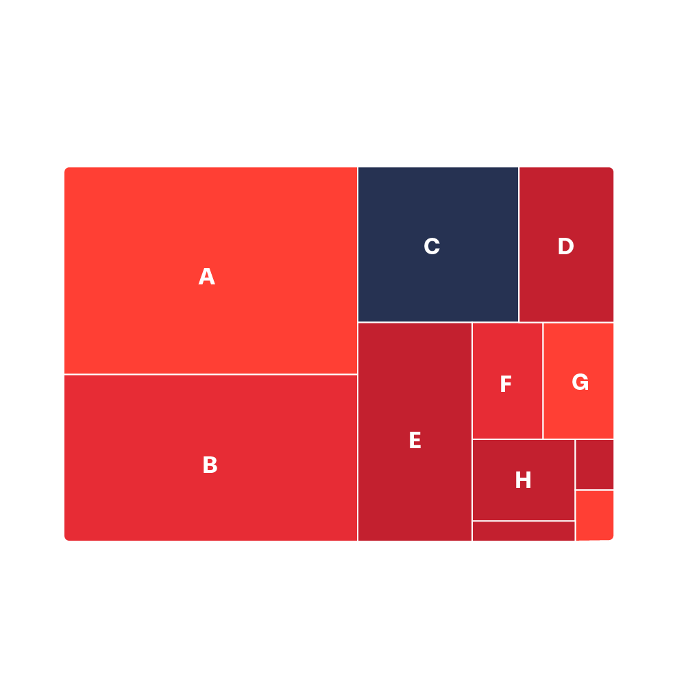 {width="189"}  {width="188"}```{r} <- paste ("Group" , 1 : 9 )<- c ("A" , "C" , "B" , "A" , "A" ,"C" , "C" , "B" , "B" )<- c (7 , 25 , 50 , 5 , 16 ,18 , 30 , 12 , 41 )<- data.frame (group, subgroup, value) ``` ```{r, warning=FALSE} ggplot(df, aes(area = value, fill = group)) + geom_treemap() ``` ```{r} ggplot (df, aes (area = value, fill = value)) + geom_treemap ()``` ```{r} ggplot (df, aes (area = value, fill = group, label = value)) + geom_treemap () + geom_treemap_text ()``` ```{r} ggplot (df, aes (area = value, fill = group, label = value)) + geom_treemap () + geom_treemap_text (colour = "white" ,place = "centre" ,size = 15 )``` ```{r} ggplot (df, aes (area = value, fill = group,label = paste (group, value, sep = " \n " ))) + geom_treemap () + geom_treemap_text (colour = "white" ,place = "centre" ,size = 15 ) + theme (legend.position = "none" )``` ```{r} ggplot (df, aes (area = value, fill = value, label = group)) + geom_treemap () + geom_treemap_text (colour = "white" ,place = "centre" ,size = 15 )``` ```{r} ggplot (df, aes (area = value, fill = value, label = group)) + geom_treemap () + geom_treemap_text (colour = "white" ,place = "centre" ,size = 15 ,grow = TRUE )``` ```{r} ggplot (df, aes (area = value, fill = value,label = group, subgroup = subgroup)) + geom_treemap () + geom_treemap_subgroup_border (colour = "white" , size = 5 ) + geom_treemap_subgroup_text (place = "centre" , grow = TRUE ,alpha = 0.25 , colour = "black" ,fontface = "italic" ) + geom_treemap_text (colour = "white" , place = "centre" ,size = 15 , grow = TRUE )``` ```{r} ggplot (df, aes (area = value, fill = value, label = group)) + geom_treemap () + geom_treemap_text (colour = c (rep ("white" , 2 ),1 , rep ("white" , 6 )),place = "centre" , size = 15 ) + scale_fill_viridis_c ()``` ```{r} ggplot (df, aes (area = value, fill = group, label = value)) + geom_treemap () + geom_treemap_text (colour = "white" ,place = "centre" ,size = 15 ) + scale_fill_brewer (palette = "Blues" )``` ## Sunburst Diagram {#sunburst-diagram}  {width="186"}  {width="186"}```{r} # Create data <- list (label = c ("A" , "B" , "C" , "D" ),parent = c ("" , "A" , "A" , "B" ),value = c (10 , 20 , 30 , 40 )<- data.frame (data)# Create sunburst chart <- plot_ly (data, ids = ~ label, labels = ~ label, parents = ~ parent, values = ~ value,type = 'sunburst' )``` ```{r} # Sample hierarchical data (Organization Structure) <- list (id = c ("CEO" , "HR" , "HR-Manager" , "HR-TeamLead" , "HR-Staff" , "Finance" , "Finance-Manager" , "Finance-Accountant" , "Finance-Analyst" , "IT" , "IT-Manager" ,"IT-Developer" , "IT-QA" ),parent = c ("" , "CEO" , "HR" , "HR" , "HR" , "CEO" , "Finance" , "Finance" , "Finance" , "CEO" , "IT" , "IT" , "IT" ),value = c (1 , 1 , 3 , 10 , 1 , 1 , 1 , 4 , 2 , 1 , 1 , 6 , 3 )<- data.frame (data)# Create sunburst chart for organization structure <- plot_ly (data, ids = ~ id, labels = ~ id, parents = ~ parent, values = ~ value, type = "sunburst" )# Display the chart ``` ```{r} # Sample hierarchical data (File System Usage) <- list (id = c ("Root" , "usr" , "usr-bin" , "usr-lib" , "usr-local" , "home" , "home-user1" , "home-user2" , "home-user3" , "var" , "var-log" , "var-tmp" , "var-cache" ),parent = c ("" , "Root" , "usr" , "usr" , "usr" , "Root" , "home" , "home" , "home" , "Root" ,"var" , "var" , "var" ),value = c (100 , 50 , 30 , 20 , 10 , 50 , 20 , 15 , 15 , 30 , 25 , 15 , 10 )<- data.frame (data)# Create sunburst chart for file system usage <- plot_ly (data, ids = ~ id, labels = ~ id, parents = ~ parent, values = ~ value, type = "sunburst" )# Display the chart ``` ## Nightingale Chart {#nightingale-chart}  {width="183"}```{r} # Simulasi data mirip dengan Nightingale dataset set.seed (123 )<- data.frame (Month = rep (month.abb, 2 ), # 12 bulan, 2 periode Year = rep (c (1854 , 1855 ), each = 12 ),Disease = sample (50 : 150 , 24 , replace = TRUE ), # Kematian karena penyakit Wounds = sample (10 : 50 , 24 , replace = TRUE ), # Kematian karena luka Other = sample (5 : 30 , 24 , replace = TRUE ) # Kematian lainnya # Ubah data ke long format <- nightingale_sim %>% pivot_longer (cols = c (Disease, Wounds, Other), names_to = "Cause" , values_to = "Rate" ) %>% mutate (Month = factor (Month, levels = month.abb), # Urutan bulan Period = ifelse (Year == 1854 , "April 1854 to March 1855" , "April 1855 to March 1856" )# Plot Nightingale Chart (Coxcomb Chart) ggplot (nightingale_long, aes (Month, Rate, fill = Cause)) + geom_col (width = 1 , position = "identity" ) + coord_polar () + facet_wrap (~ Period) + scale_fill_manual (values = c ("skyblue3" , "grey30" , "firebrick" )) + scale_y_sqrt () + theme_void () + theme (axis.text.x = element_text (size = 9 ),strip.text = element_text (size = 11 ),legend.position = "bottom" ,plot.background = element_rect (fill = alpha ("cornsilk" , 0.5 )),plot.margin = unit (c (10 , 10 , 10 , 10 ), "pt" ),plot.title = element_text (vjust = 5 )+ ggtitle ("Simulated Nightingale Chart: Causes of Mortality in the Army" )``` ## Voronoi Diagram {#voronoi-diagram} 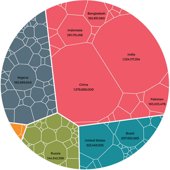 {width="204"}```{r} # Data set.seed (1 )<- sample (1 : 400 , size = 100 )<- sample (1 : 400 , size = 100 )<- sqrt ((x - 200 ) ^ 2 + (y - 200 ) ^ 2 )<- data.frame (x, y, dist = dist)``` ```{r} ggplot (df, aes (x, y)) + stat_voronoi (geom = "path" ) ``` ```{r} ggplot (df, aes (x, y)) + stat_voronoi (geom = "path" ) + geom_point () ``` ```{r} ggplot (df, aes (x, y)) + stat_voronoi (geom = "path" ,color = 4 , # Color of the lines lwd = 0.7 , # Width of the lines linetype = 1 ) + # Type of the lines geom_point ()``` ```{r} ggplot (df, aes (x, y, fill = dist)) + geom_voronoi () + geom_point () ``` ```{r} ggplot (df, aes (x, y, fill = dist)) + geom_voronoi () + stat_voronoi (geom = "path" ) + geom_point () ``` ```{r} ggplot (df, aes (x, y, fill = dist)) + geom_voronoi (alpha = 0.75 ) + stat_voronoi (geom = "path" ) + geom_point () ``` ```{r} ggplot (df, aes (x, y, fill = dist)) + geom_voronoi () + stat_voronoi (geom = "path" ) + geom_point () + scale_fill_gradient (low = "#F9F9F9" ,high = "#312271" ) ``` ```{r} ggplot (df, aes (x, y, fill = dist)) + geom_voronoi () + stat_voronoi (geom = "path" ) + geom_point () + theme (legend.position = "none" ) ``` ### Bounding box ```{r} # Circle <- seq (0 , 2 * pi, length.out = 3000 )<- data.frame (x = 120 * (1 + cos (s)),y = 120 * (1 + sin (s)),group = rep (1 , 3000 ))ggplot (df, aes (x, y, fill = dist)) + geom_voronoi (outline = circle,color = 1 , linewidth = 0.1 ) + scale_fill_gradient (low = "#B9DDF1" ,high = "#2A5783" ,guide = FALSE ) + theme_void () + coord_fixed ()```